Your New Home Page: Introducing the PLU Member Dashboard
A single, personal landing place that brings together everything that matters most about your PLU life
Drew
Apr 30, 2026 · 3 min read
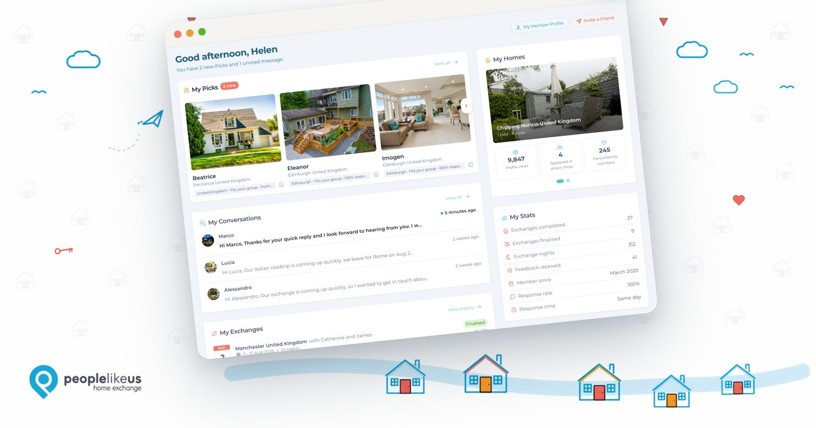
We've been quietly working on something we think you're going to love.
Until now, when you logged into PLU, there wasn't really a place that felt like yours. You'd land on the homepage, or jump straight to search, and your messages, your Picks, your exchanges, your saved searches were all in different corners of the site. It worked, but it didn't feel quite right.
So we've built one.
Your new Member Dashboard is a single page that brings together the most important parts of PLU into one warm, personal place. Think of it as opening a letter from a friend who's done some homework for you. 🙂
What you'll find there
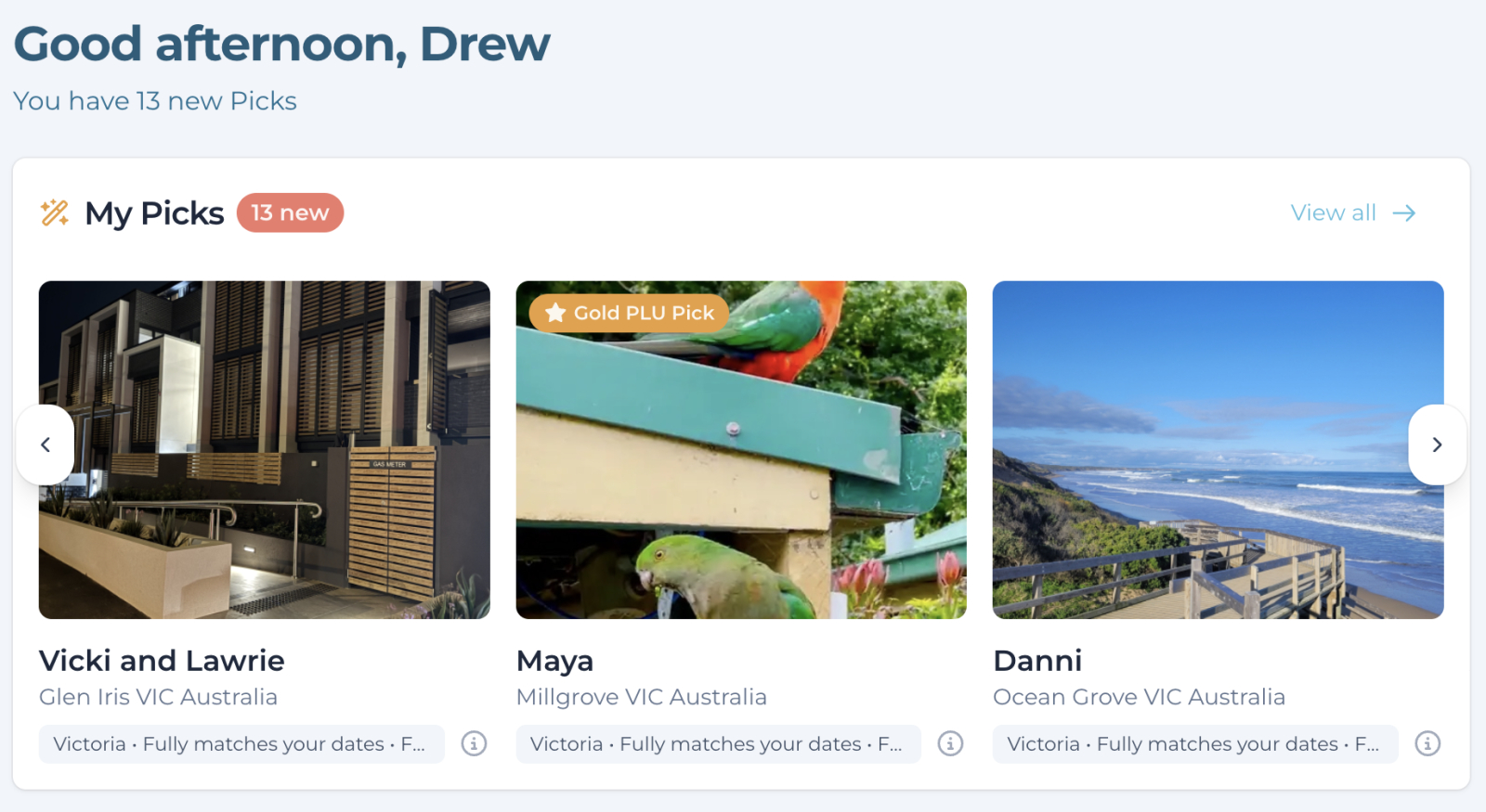
Your PLU Picks are front and centre at the top — the homes we've matched to you, refreshed regularly, ready to browse without going looking for them.
Your messages are one tap away, with unread conversations easy to spot so nothing slips through.
Your exchanges — upcoming, in progress, and the ones you've already had — all in one place. There's something rather lovely about seeing your travel year laid out at a glance.
Your desired destinations and saved searches are right there too, with a count of new listings since you last looked. "Coastal Portugal — 3 new homes since last week" is a much better reason to click than just remembering to check.
Your home profile (just swipe if you have more than one) gets a little spotlight of its own, with stats showing how often it's appeared in other members' Picks and how it's performing in the Community.
Your member stats — exchange count, member since, the things that quietly tell the story of your PLU journey — are there too. We think they're worth being proud of.
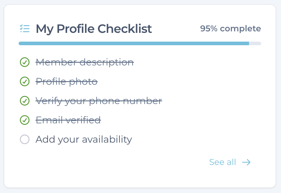
And for newer members, a gentle "Getting Started" checklist that walks you through the steps that lead to your first exchange.
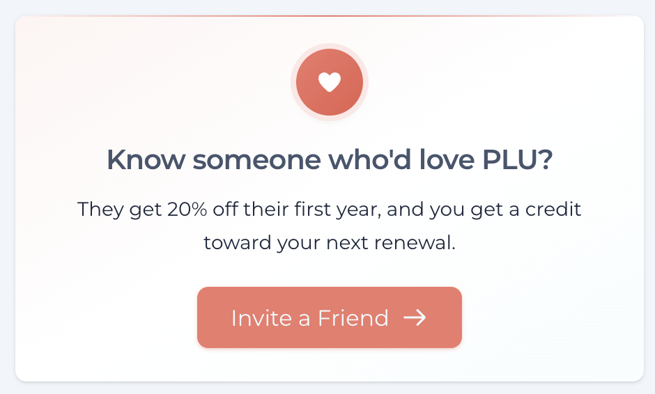
There's also a direct link through to Invite a Friend, because the people who join through your recommendation are usually the ones who fit the Community best.
Why we built it
Two reasons, really.
First, PLU has grown. With more homes, more Communities, more features, and now Picks arriving regularly, we wanted a place where it all came together — without any of it feeling cluttered.
Second, your time is worth something. The dashboard is designed to give you the most valuable five minutes you'll spend on PLU each day. Open it, see what's new, see what's worth your attention, and get on with your day (or get lost down a delightful rabbit hole — no judgement).
How to find it
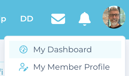
It's now your default landing page when you log in. You can also get to it any time from the main menu — just click "My Dashboard" on your Member Menu (click your photo).
Have a wander through it. Let us know what you think in the comments below. And if there's something you'd love to see on it that isn't there yet, tell us — this is very much something we'll keep refining as we learn how you use it. 🏡
Comments (22)
Log in to join the conversation.

Bravo, c'est très bien fait ! Belle journée ! Denise

Love al the information on one paged! Thank you!

Wow, this is fantastic! Thanks so much to you and your team, Drew. You’ll continue to amaze us with the innovative improvements to make our interactions with the site better each time.

Thank you! This is great!🙏

This is great Drew! I really love the summary and saves me a lot of time when trying to find something specific on the site! Thank you!

Fantastic! Thank you for making People Like Us feel more like us. The corners of my mouth turn up every time I get a PLU email notification. I especially love it when our tool for happiness gets an update. Now that we have our dashboard, let's start making it even better. Refining is a quest that you will likely do for the duration! Here are three suggestions: - Can we get a prominent "copy home link" feature? When I copy my home link from the dashboard, it's the edit link (not the view link). I struggle with a quick way to copy my home link (and still haven't figured out how to do it easily on my phone) - I would love a differentiator on the exchanges to show direction. For my own upcoming exchanges, it looks like I have a duplicate. But it's not... but they look the same. The "me to their home" (Part of a completed non-sim) appears exactly like the "them to my home" (part of next year's repeat non-sim!). Perhaps a house icon for that shows an exchange is a stay at my home? (and a suitcase icon for stays at their home) - For my stats, could you include the clickable (i) icon so that we can click to see the full stats? I always check member stats, since I prefer to host members who have hosted an equitable number of nights that they are guests.

Thanks for the suggestions, Barrie. We'll fix up the descriptors on the Exchanges panel and give both sets of dates for non-sims, and we'll add the stats popup. We likely won't add the "copy home" on the dashboard but we'll add a link to view your home profile as that's where the button is, right at the top of that page.
Changes are made .. check them out! 😃


This is SO much better! So much information in one place. Absolutely love it. Thank you Drew.
Ah, you're very welcome, glad you like it!



We love it, this is just perfect!!
Thank you!!

Wow!!! Just checked and just can say WOW 😍 !!!!!
Thanks, Corinne, we're really happy with how this one turned out. 🙂