Meet the member, not just the house
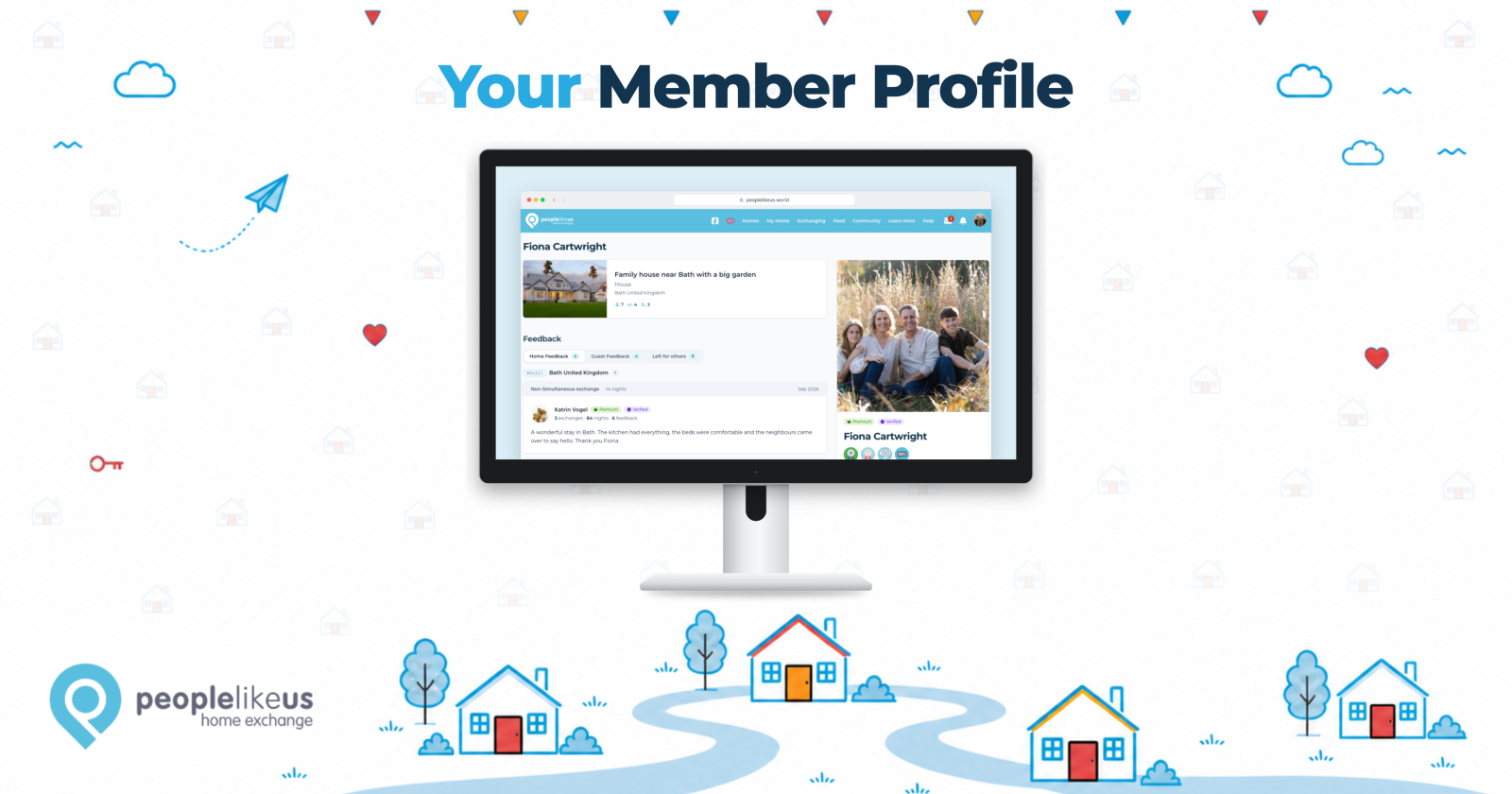
Every member now has a proper profile page, so clicking a name takes you to the person first
Drew
Oct 13, 2026 · 3 min read
Home exchange has always been about people. You’re not "booking" a room from a faceless host; you’re handing your keys to someone you’ve come to know a little, and they’re handing theirs to you. It’s the whole reason People Like Us works.
So here’s something that’s quietly bothered us for a while: When you clicked a member’s name anywhere on PLU (in an exchange, in the Feed, in a Community list), you didn’t land on them. You landed on their home.
If they only had one home listed, you didn’t even get a choice. Straight through to the listing, with a small card about them tucked off to one side. On a phone, that card was easy to miss altogether. Lovely home. But who are these people?
That’s changed. Every member now has a profile page of their own.
Their homes, all in one place
If a member has more than one home, you’ll now see them together, each with the details you’re used to from the Feed: where it is, how many it sleeps, and the kinds of exchanges they’re open to. One home or four, you get the same view of who you’re talking to.
What other members say
Feedback now lives on the profile, sorted into tabs. You can see it by home, read what their guests had to say, and see the feedback they’ve left for others. It’s the whole picture rather than one page of it.
A note on privacy: your feedback is still yours to control. If you’ve chosen not to show feedback on any of your homes, it stays hidden on your profile too. We’ve erred on the side of privacy throughout.
Trusted by
If other members have vouched for someone, you’ll see it here. Trust is one of the quieter things about PLU, and we felt it deserved a proper place.
Where they’d love to go
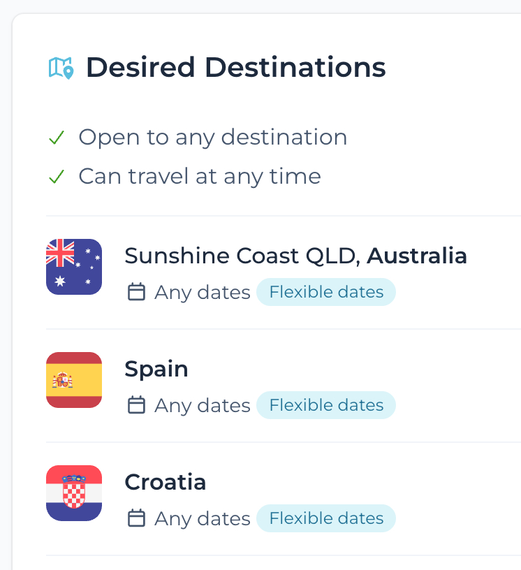
Desired Destinations now appear on the profile, and they’ve picked up country flags along the way. You’ll spot the flags on your dashboard and your own Destinations page too. A small thing, but it makes a list of place names much easier to take in at a glance (and it’s often the first sign that you and another member might be a good match).
The little things
Long lists tuck themselves behind a Show more, so a member with a dozen destinations doesn’t push everything else off the screen. If someone has added a video, there’s a link to watch it. If they travel as a couple, their partner’s card sits alongside theirs. And the buttons you’d expect (send an enquiry, pick up a conversation, give someone your trust) are right where you’d look for them.
One change you’ll notice
Member names across PLU now open the profile rather than the homes list. Same click, different destination: the person first, their homes a scroll away.
We’d love to hear what you think, and what you’d like to see on a profile that isn’t there yet. Member Support is always happy to hear from you.
Here’s to knowing each other a little better. 🏡
Comments (5)
Log in to join the conversation.

Dear Drew, dear PLU team, This change is perfect. My routine, whenever I look at a new home, is looking for the plu=er first 😁. This will safe me a ton of time scrolling down. It’s wonderful to see how you keep developing, always with the end-user in mind. You should be so proud of that. Wishing you a lovely day 👋 Hilde

Love it! You are always enhancing the site to make it so wonderful and easy! Thanks so much for all you do, Drew!

You're very welcome, thank you Ramani! I use the site a lot myself and I'm very much enjoying the way it works these days too. Still plenty to do, though! ❤️
